In this project, I used SQL, and Power BI to create a dashboard to help identify the best counties in North Carolina for opening an oral surgery practice.
Problem
My two older brothers are oral surgery residents and wanted an easy way to view information that would give them insight on where to potentially begin their careers as oral surgeons in North Carolina.
Data Sources
County data was downloaded from the NCACC 2024 County Map Book. Data on oral surgeon and general practitioner counts were provided to me by my brothers.
Understanding Oral Surgeon Needs
Talking with my brothers, I was able to develop an understanding of the information that would be most relevant to them. Aside from the obvious information, like oral surgeon and population counts, we concluded that data that gives insight into socioeconomic status, demographics, and referral potential was important to include in the dashboard. Additionally, we established that there should be metrics that give a general idea of competitiveness in any given county:
Surgeons per 100,000 Population – To show how saturated or underserved a county is
Population per Surgeon – To show potential patient demand and workload in each county
General Practitioners per 100,000 Population – To show potential strength of referral networks
Here is the query that shows these metrics:
|
1 2 3 4 5 6 7 8 9 |
select prac.county_id, case when oral_surgeon_count !=0 then population_count / oral_surgeon_count else null end as population_per_surgeon, 100000 * (oral_surgeon_count / population_count) as surgeons_per_100k_popul, case when general_practice_count !=0 then population_count / general_practice_count else null end as population_per_general_prac, 100000 * (general_practice_count / population_count) as general_prac_per_100k_popul from practitioner_counts prac --VIEW inner join counties_population_details popu --VIEW on prac.county_id = popu.county_id |
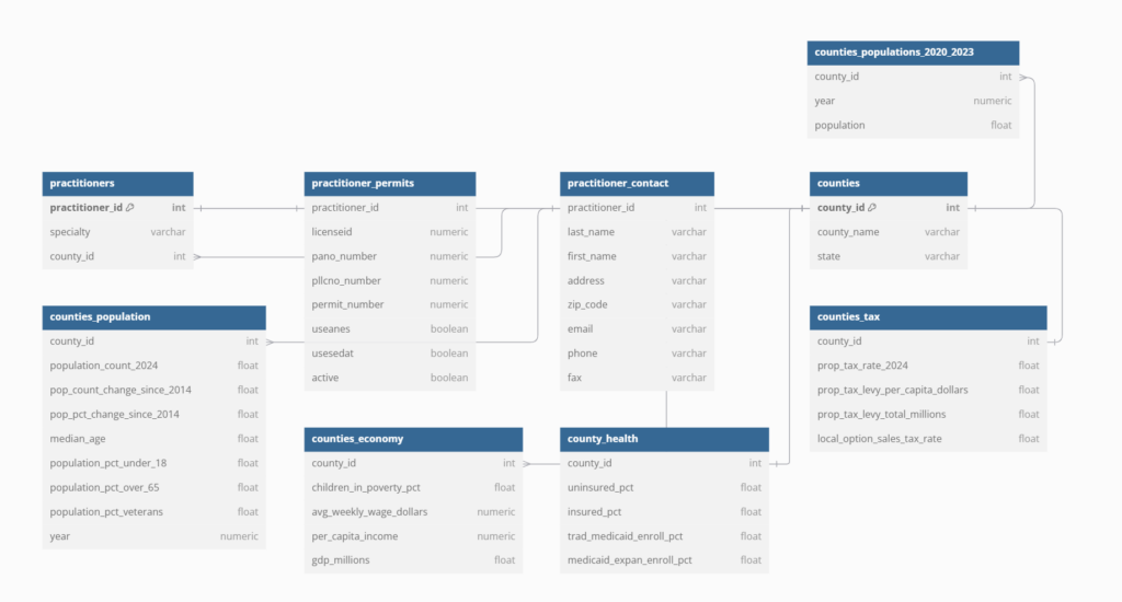
ERD Design

I used this project as an opportunity to learn a little bit about database design. This is how I ended up designing the entity-relationship diagram.
Power BI
Almost all transformations were done using SQL, so my time in Power BI was spent trying to present the information as clearly as possible.
Thank you for reading.